-
My Role
UX ResearcherUX Designer -
Tools Used
FigmaOptimal Workshop
My Process
-
Empathize
Created Persona and player journey -
Research
Performed Heuristic Evaluation on current game UIStructured Interviews -
Ideate
Concept IdeationLo-Fi wireframe/sketchWireframe testing -
Design
High Fidelity PrototypeInteraction Design
Problem
Statement:
The objective of this project was to evaluate the usability of
Minecraft Dungeons and make iterative improvements to the UI in order
to enhance the player's experience.
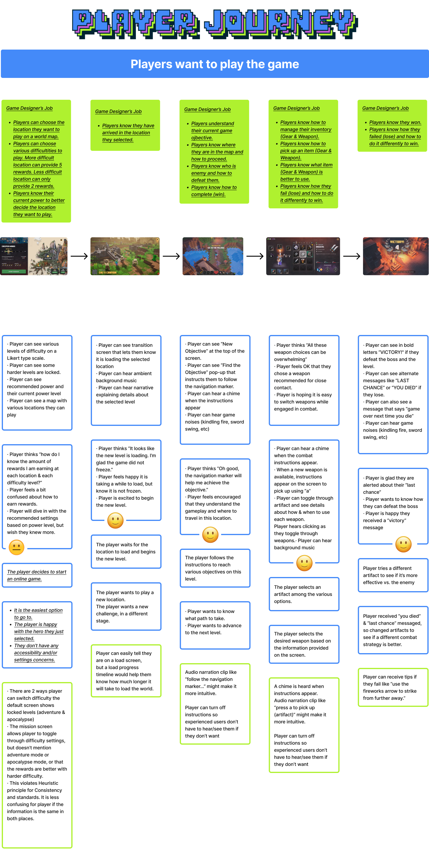
Empathize:
Developed a player/user journey based on the existing gameplay &
Ul. This simultaneously creates empathy for the user and reveals an
understanding of a player's pain points and the overall user
experience.

Developed a persona to better
understand user motivations and frustrations.

Paper Prototype
Created a paper prototype to improve the
player experience. This process helped organize a flow chart/user flow
for the game’s menu system.


Developed a proposed user flow that would
bring a more intuitive navigation to the the game.


I developed an icon set that complements
the menu labeling, making it easier for players to find information
quickly. Additionally, the icons were designed in a 'Minecraft'-style
theme to resonate with fans and align with the brand identity.

The prototype introduces a carousel
format, taking the iterated wireframe a step further. The labeling and
menu system is more intuitive so even a casual gamer will be able to
navigate through the menus.

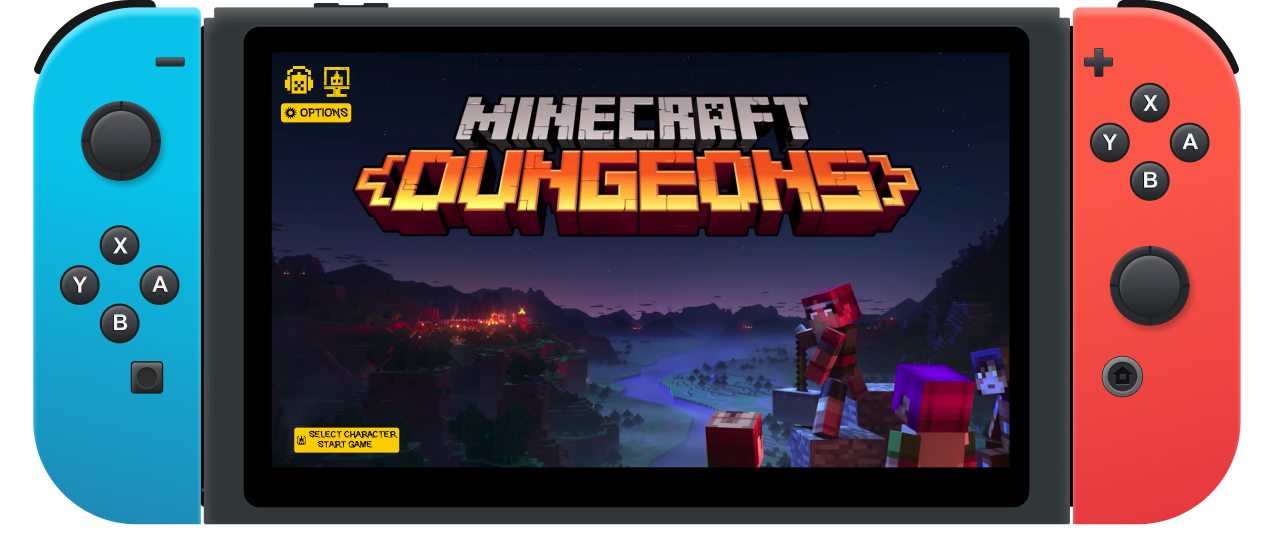
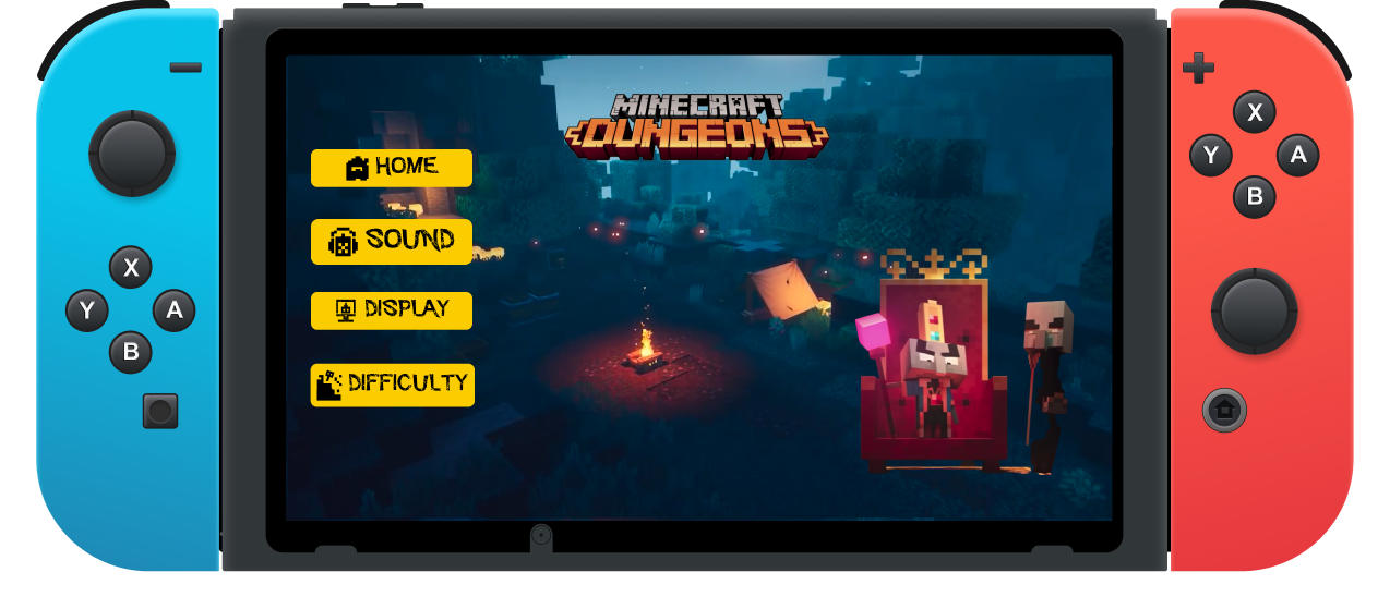

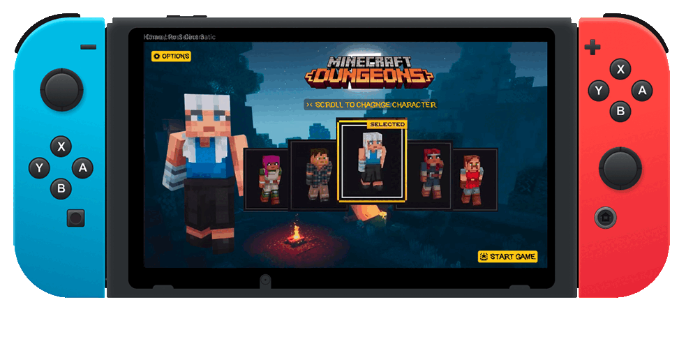
Although the
menu system and character select screens are different, Minecraft
Dungeons is already available for the Switch.
However, I iterated further on a mobile version of the game, which addressed the needs of the persona, Stuart. A mobile version would offer some flexibility of when he can play. If he is stuck waiting somewhere, he can play from his wireless device instead of waiting to get home before he can play.
However, I iterated further on a mobile version of the game, which addressed the needs of the persona, Stuart. A mobile version would offer some flexibility of when he can play. If he is stuck waiting somewhere, he can play from his wireless device instead of waiting to get home before he can play.
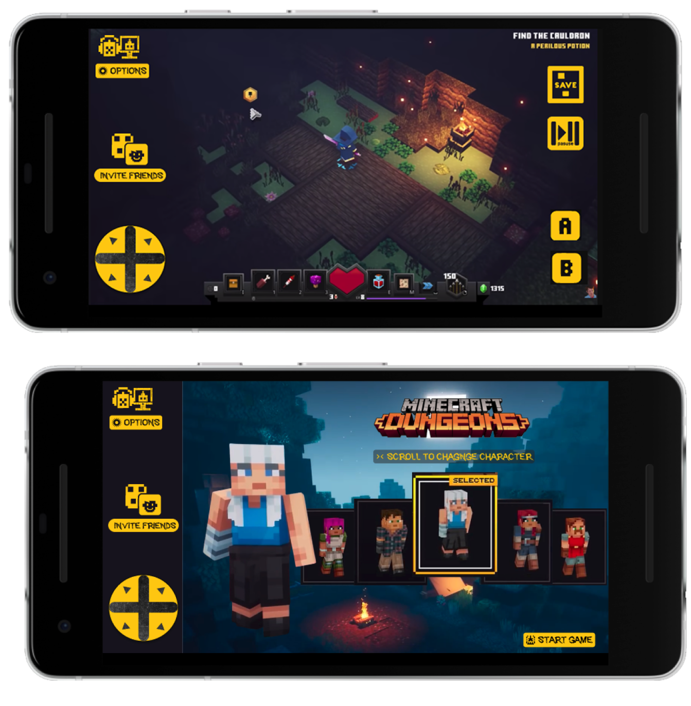

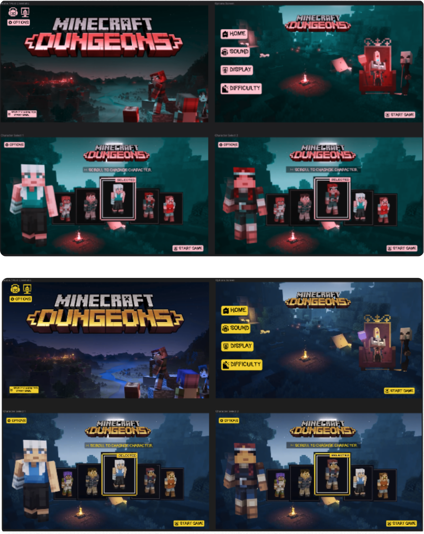
I tested the prototype with a color blind
simulator tool. It yielded good results: Nice contrast with yellow/black
button scheme, still visible by most with a color vision handicap.