-
Role
UX ResearcherUX Designer -
The Team
1x Project Lead3x UX Researchers3x UX Designers -
My Key Contributions
User Research StrategyInteraction DesignProject ManagerMarket Research -
Tools Used
FigmaOptimal WorkshopMazePhotoshopBalsamiqTableau
My Process
-
Empathize
Analyzed market data to understand consumer demand for and user struggles with financial budgets and retirement planning
-
Research
First Click TestsStructured InterviewsTree TestingCard SortingSurveys -
Specify
Identify Pain PointsPrioritize Issues -
Ideate
Concept IdeationLo-Fi wireframe/sketch -
Design
High Fidelity PrototypeInteraction Design -
Verify
User Testing
Problem:
People between the ages of 30 and 40 often
struggle with managing their finances and planning for retirement.
Challenge:
Many people in this age group have
competing financial priorities, which can make it difficult to
save for retirement. There is also a lack of accessible and
user-friendly tools that integrate budgeting and retirement
planning.
Learning about users and market demand:
To learn about potential users and gauge
interest in the app, we designed
a survey that was sent to a group of contacts that were in our target demographic (people in their 30's).
a survey that was sent to a group of contacts that were in our target demographic (people in their 30's).
Survey Results

Getting Started/Competitor Analysis:
Since we didn't have an existing prototype
yet, | thought it would be a
good idea to perform user testing on one of the competitor's products to
evaluate their Ul and avoid similar missteps.
good idea to perform user testing on one of the competitor's products to
evaluate their Ul and avoid similar missteps.
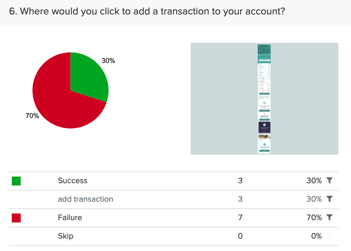
Areas of opportunity were definitely
uncovered by the first click test results.
Card Sorting
We conducted card sort tests using a list of
predetermined categories provided by the stakeholder. The card
sort allowed us to see how respondents would categorize the
information on the website/app. This enabled us to design the
information architecture with the user in mind.
Card Sorting Visualized
I applied UX principles in the
visualization. Understanding the stakeholder needs, I
visualized the results as a bar graph using Tableau to better
present the findings to stakeholders in a more familiar
format.
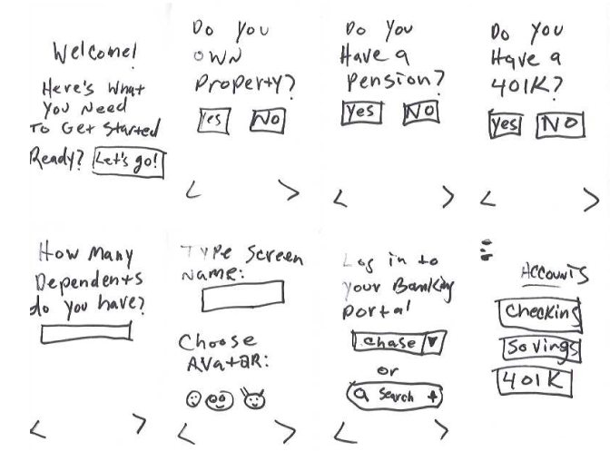
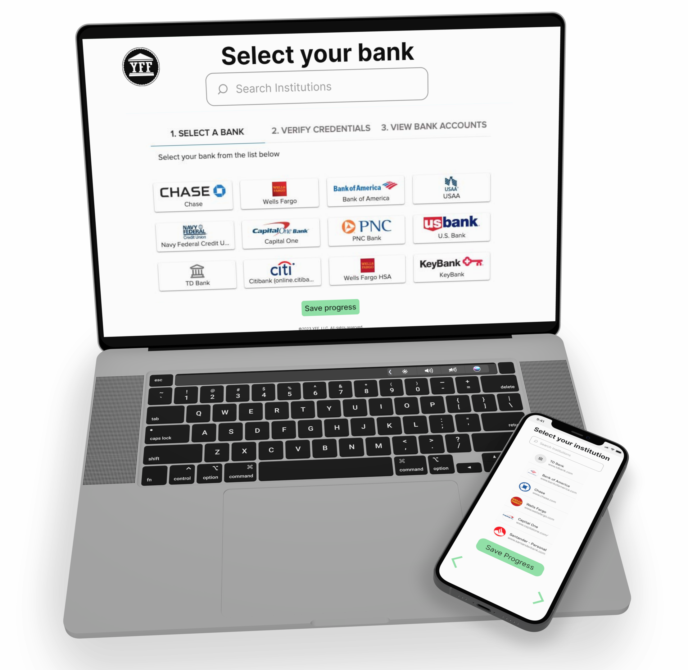
Onboarding Flowchart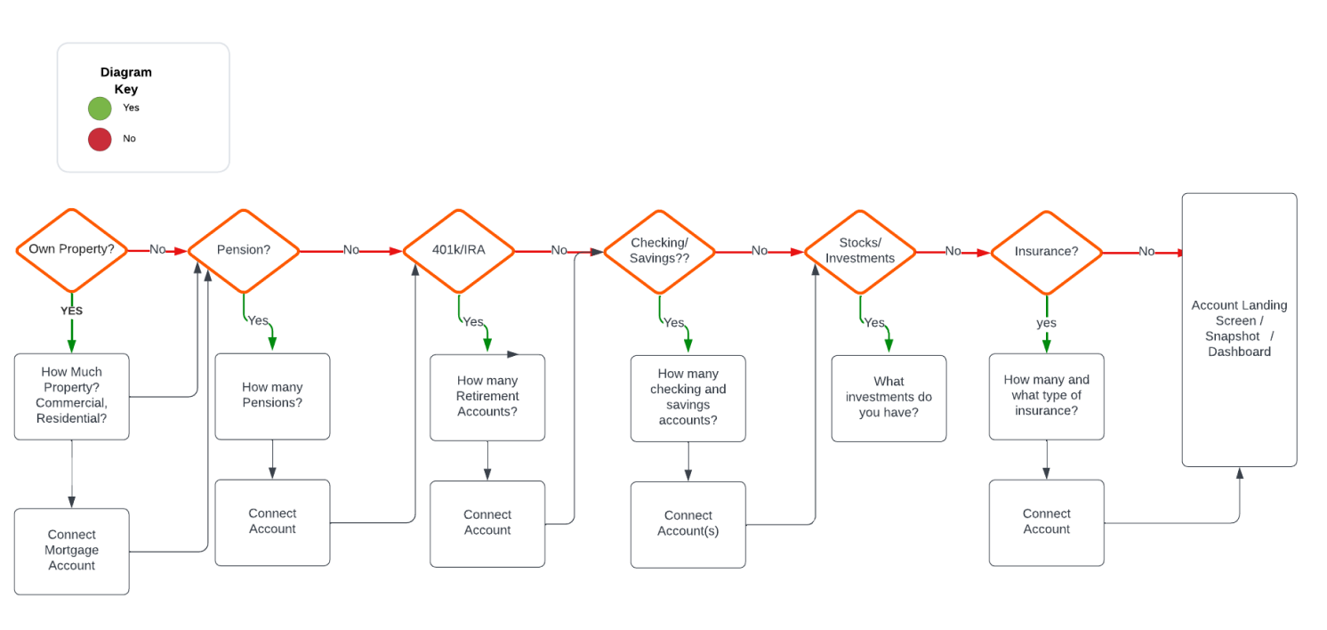
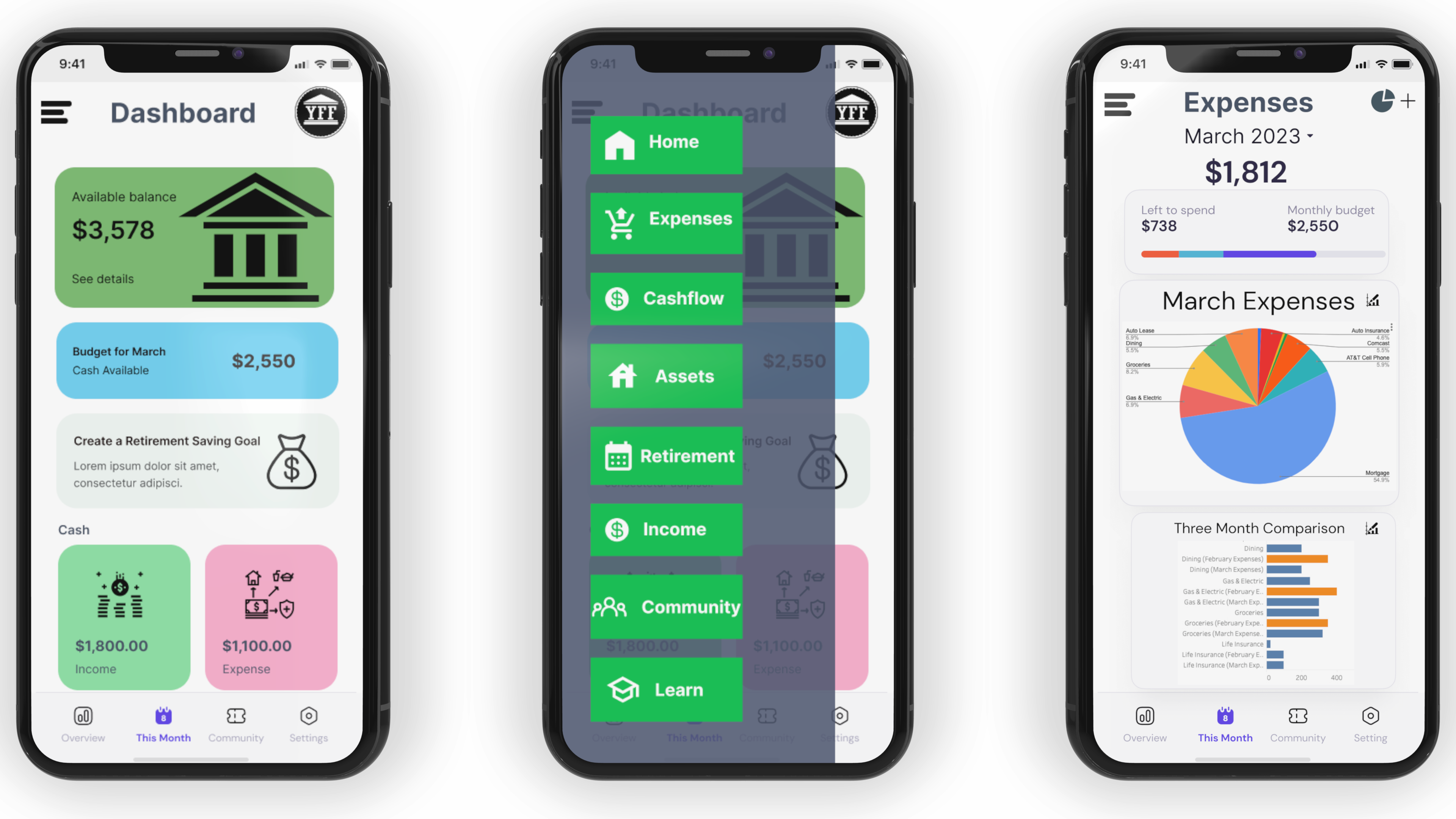
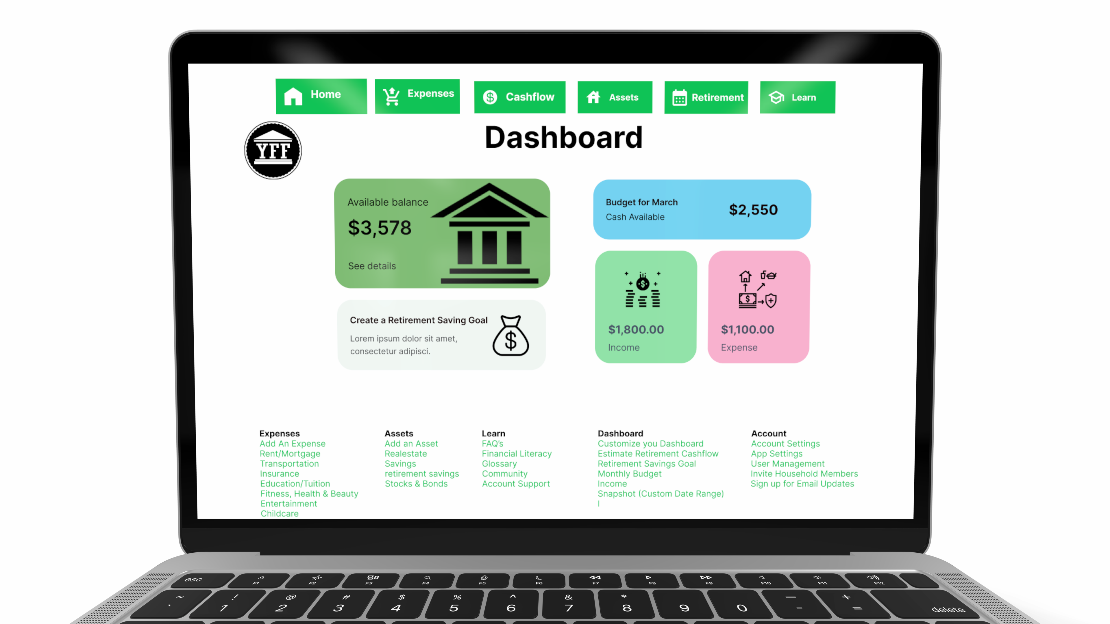
Wireframe & Prototype Screens
(Notice the scroll bar in between the second and third mobile screen below. Move the scroll bar from left to right to view the difference between the wireframe & the prototype)
Prototype and Usability Testing
After
developing the prototype and adding more details to the
wireframes, I conducted more first click tests to verify
usability and identify areas that required adjustments.
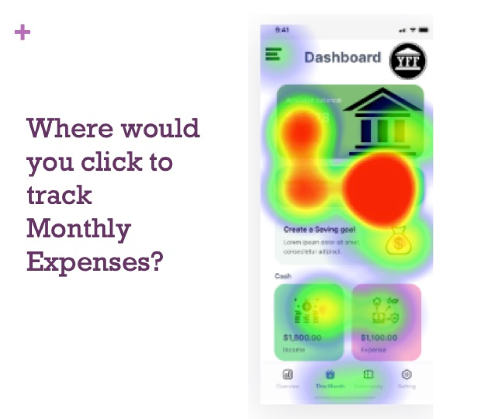
Results
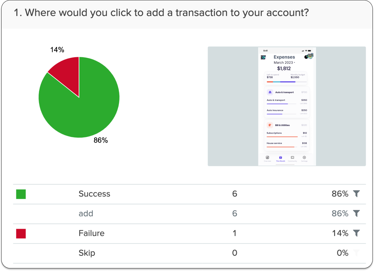
The
question about adding a transaction was asked on this first
click test for the prototype. Respondents achieved an 86%
success rate, indicating a significant improvement when
compared to the competitor's app, which only achieved a 30%
success rate for this task.
