-
Role
UX ResearcherUX Designer -
Stakeholders
Digital DirectorBack End DeveloperMarketing ManagerHispanic Marketing Manger -
Contributions
User Research StrategyParticipant RecruitmentHeuristic EvaluationUser InterviewsUsability TestingCard Sorting -
Tools
FigmaOptimal WorkshopTableauMS Teams
My Process
-
Empathize
Contextual Inquiry/Structured InterviewsPerformed Heuristic Evaluation on existing SiteConducted card sorting to analyze users' mental models for navigation -
Specify
Identify Pain PointsPrioritize Issues -
Ideate
Concept IdeationLo-Fi wireframe/sketch Make recommendations -
Design
High Fidelity PrototypeInteraction Design
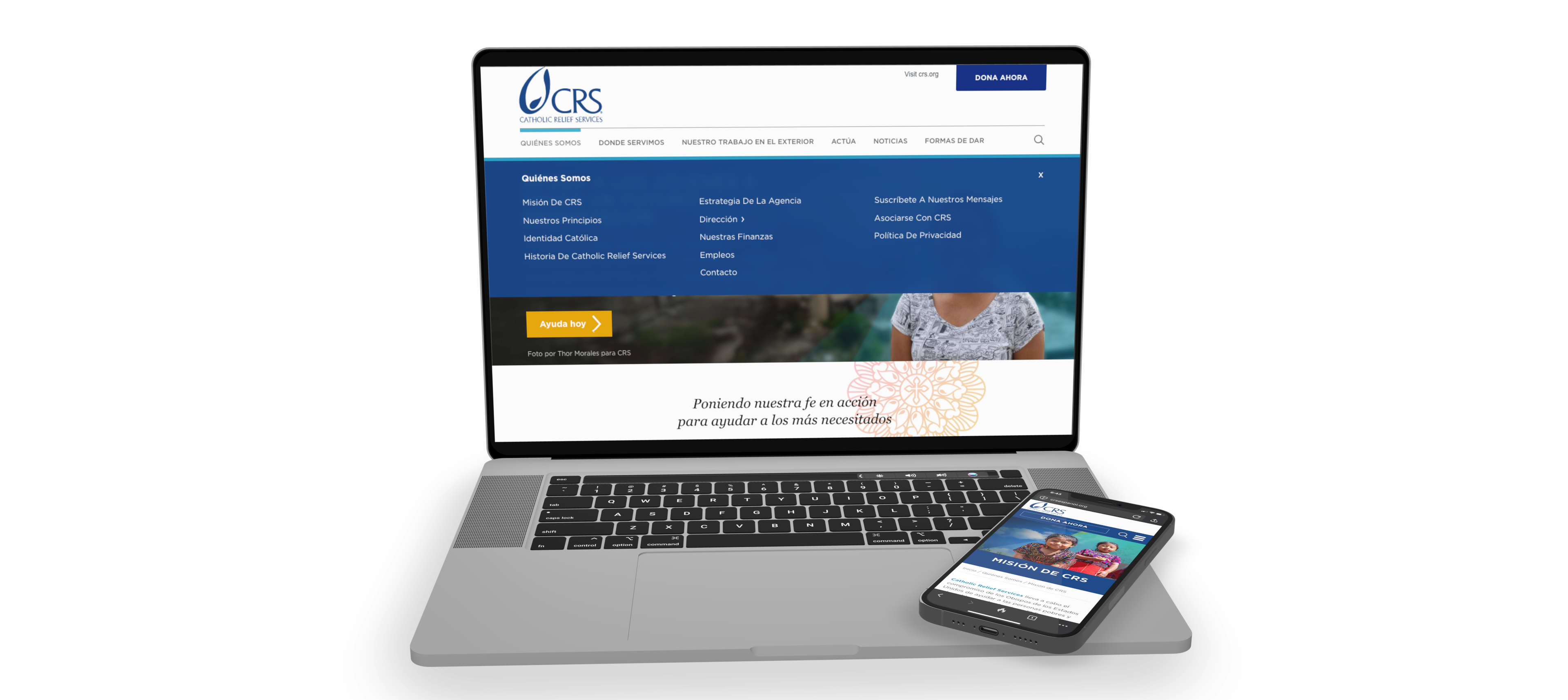
Problem
Statement: The organization's
websites had not been updated in several years. The digital team was
undergoing a planned redesign. This presents an opportunity to enhance
design and functionality.
Project
Objective: This project aims
to improve the usability, accessibility, and conversion rates of the
organization's websites by addressing key areas such as aesthetics,
navigation, and layout. Our goal is to provide design recommendations
that will lead to a more user-friendly and inclusive website, with a
particular focus on enhancing the experience for our older user base.
Heuristic Evaluation
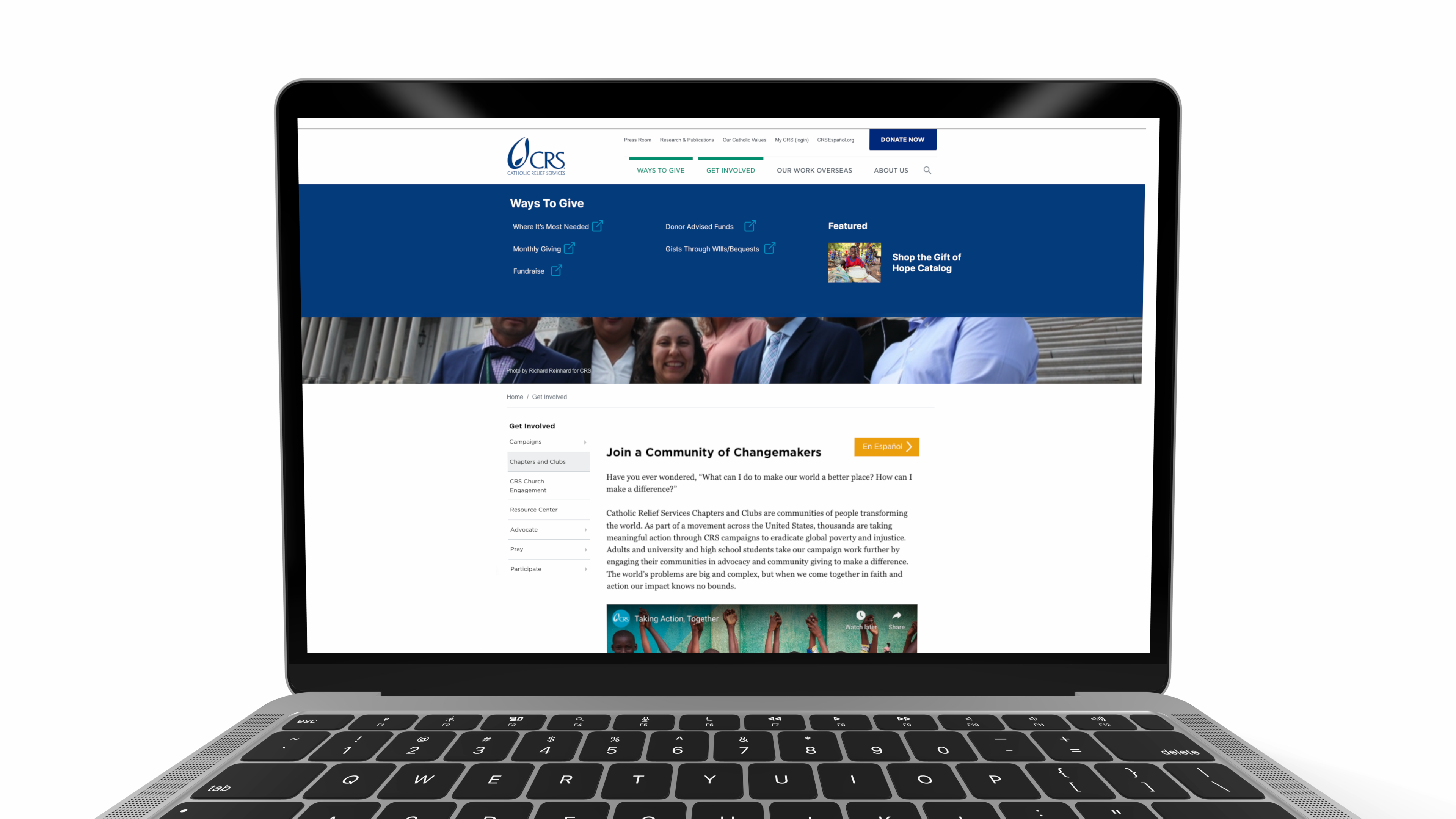
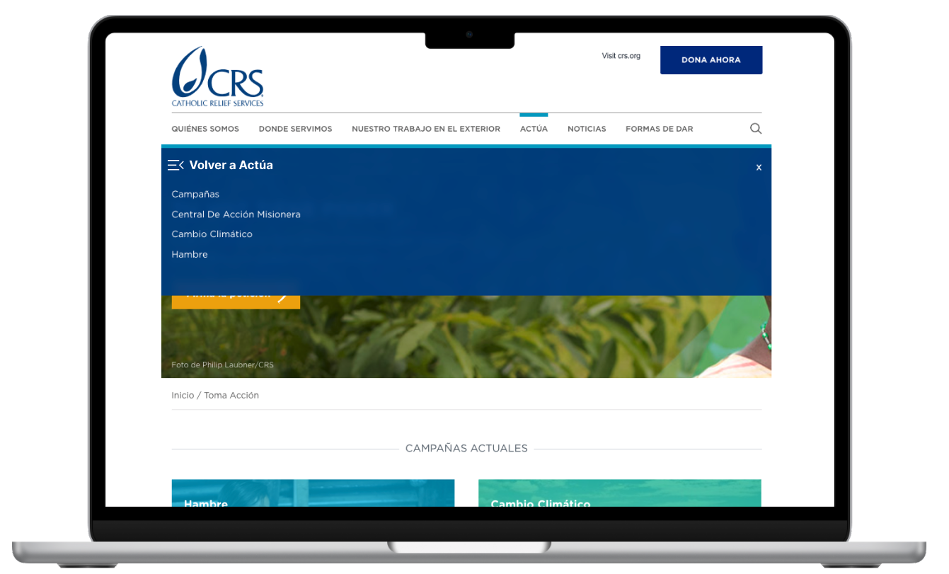
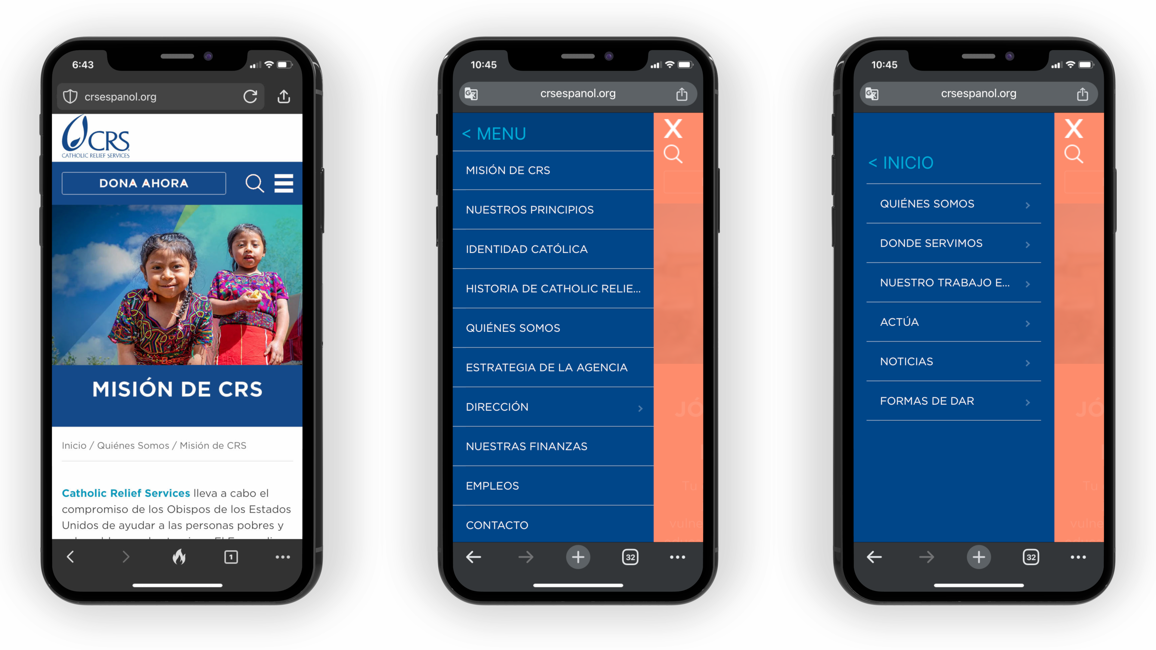
Thorough analysis of the four existing
websites in both English and Spanish to identify usability,
accessibility, and navigation issues. Issues were categorized by
severity, with recommendations provided based on ease of
implementation, cost, and impact on usability.
Information Architecture& Labeling
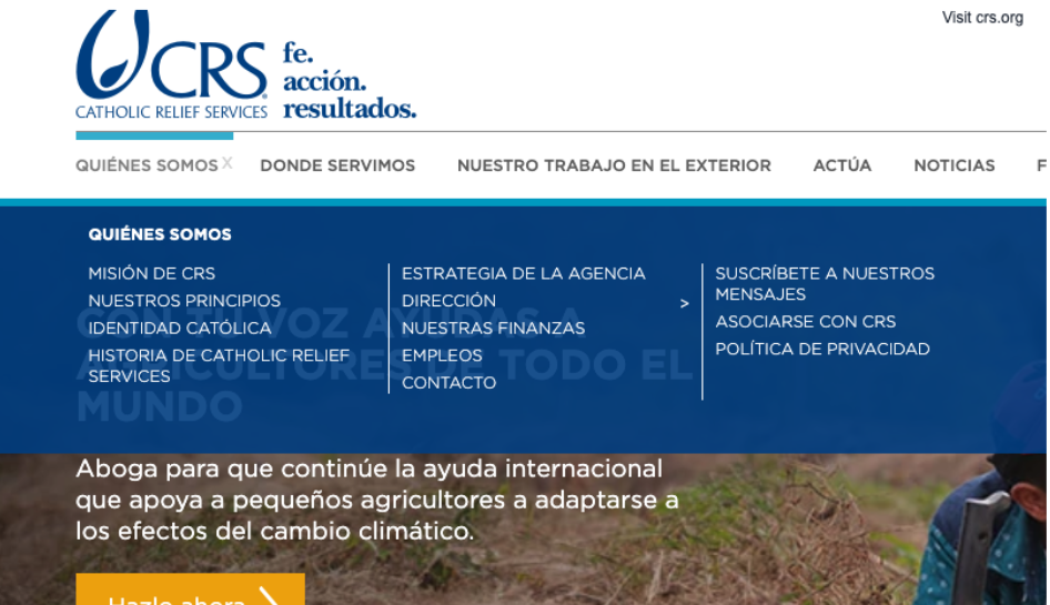
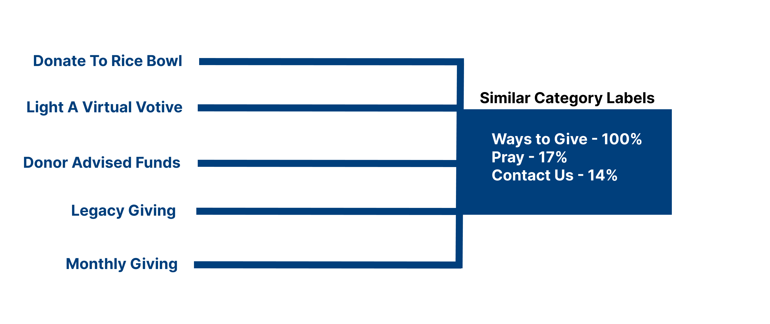
The website's navigation system was reviewed
to ensure that it is intuitive and user-friendly. It was noted that
several similar items could be combined for greater clarity.
Simplifying and clearly labeling these options will help users
quickly identify and select their desired actions, reducing
confusion and leading to research questions about optimal menu
organization and user preferences.
The website's navigation system was reviewed to
ensure that it is intuitive and user-friendly. It was noted that several
similar items could be combined for greater clarity. Simplifying and
clearly labeling these options will help users quickly identify and
select their desired actions, reducing confusion and leading to research
questions about optimal menu organization and user preferences.
Research Questions
I developed research questions following a
heuristic evaluation to validate key hypotheses. This approach
ensured that the evaluation's findings were systematically
explored through targeted research. By aligning the questions with
the identified usability issues, I aimed to confirm or challenge
the initial assumptions, leading to more informed design
decisions.
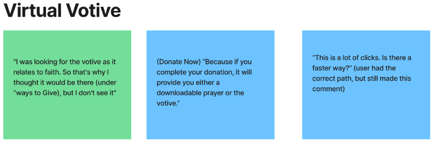
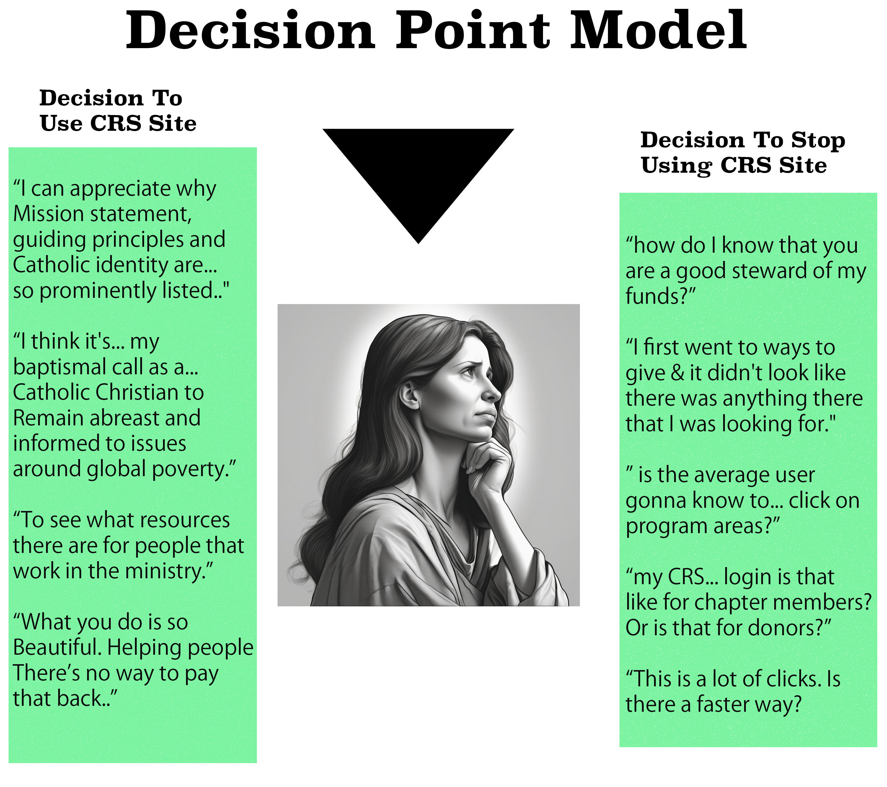
Research Results & User Quotes
Thorough analysis of the four existing
websites in both English and Spanish to identify usability,
accessibility, and navigation issues. Issues were categorized by
severity, with recommendations provided based on ease of
implementation, cost, and impact on usability.

Before and After
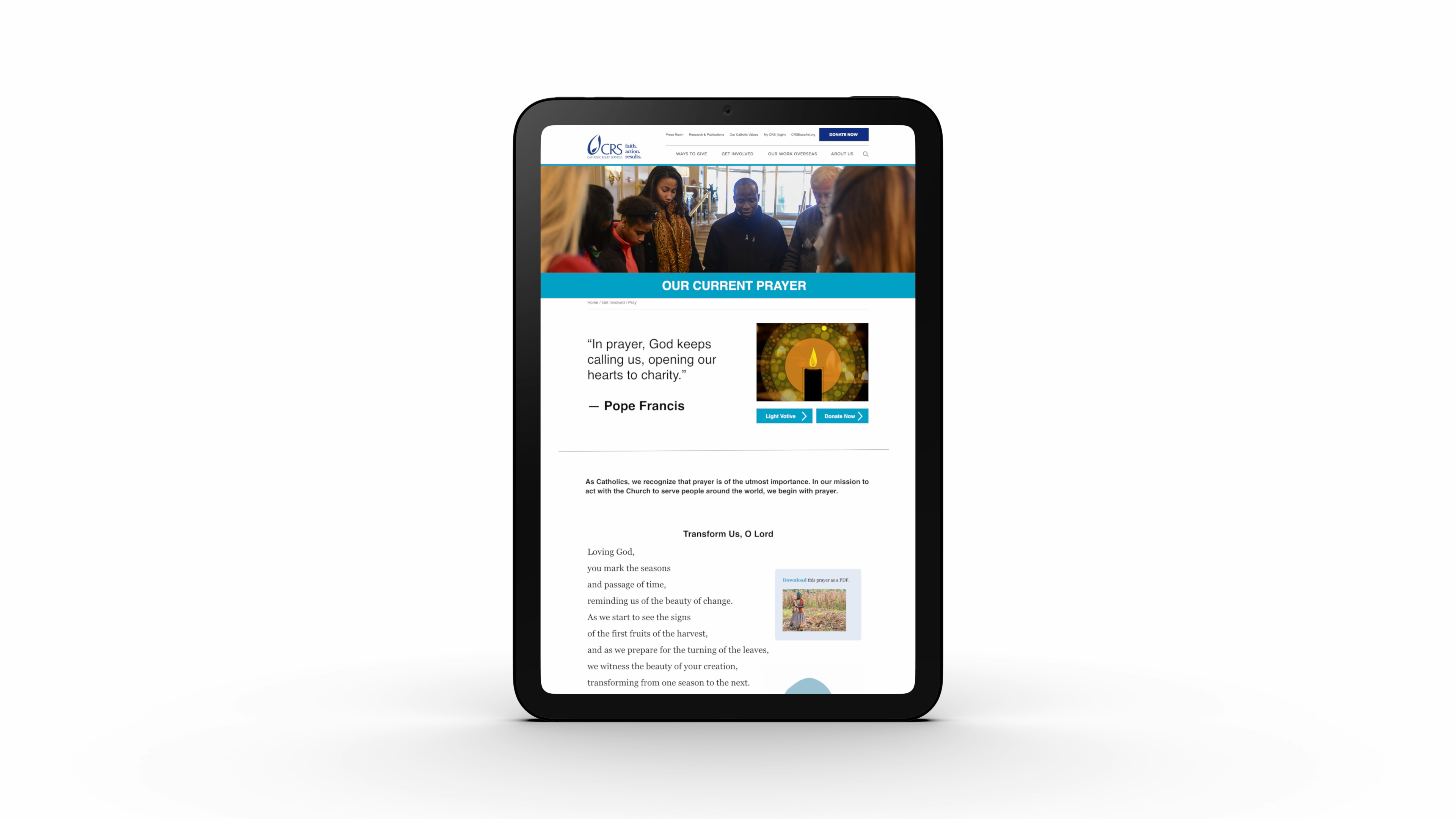
This before-and-after slider image
showcases a significant transformation in design. The original
version struggled with contrast issues in the header, which
affected readability and user engagement. The updated design
addresses these concerns and also optimizes the visual hierarchy
for better conversions. Key improvements include enhanced contrast
for the header, a strategically placed call-to-action, and a
compelling quote positioned directly below the hero section to
drive user action more effectively.
The Prototype
Thorough analysis of the four existing
websites in both English and Spanish to identify usability,
accessibility, and navigation issues. Issues were categorized by
severity, with recommendations provided based on ease of
implementation, cost, and impact on usability.
